Good Morning!
If you haven't already seen Graphic 45's blog yet, head on over so you can be one of the first to see their new CHA release! You will LOVE it -- I sure do and I can't WAIT to get my hands on it!!
In the mean time, I'd like to share a simple pocket scrapbooking layout that I made using Place In Time and A Ladies' Diary. (The sheet covers are from Echo Park.) If you're a newer scrapper or find that this newer trend in scrapping is more your style, this should be a pretty easy layout for you to mimic!
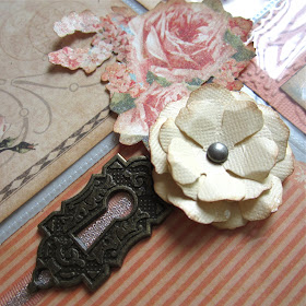
Since I love layouts to have dimension and not feel "flat", I applied some of the embellishments on the outside part of the sheet cover.
So I am in love with Graphic 45's banners. So much so, that I traced their shapes onto my Place In Time and Core'dinations paper as those paper lines don't come with banners. It's a quick little design trick that you can apply to any one of G45's older lines!
Thanks so much for looking! And again, head on over to G45's blog if you haven't already -- you're in for some amazing sneak peeks!
Many hugs,
Maria


Gorgeous, but I'm not even a little surprised :) I just can't wait for your next project :) I know you're having a blast!
ReplyDeletePaula
This is a gorgeous layout! So much detail. Love the banner. Just fabulous, Maria!
ReplyDeleteBeautiful layout Maria! Great idea to have the mix of embellies on the outside! And what a terrific idea about the banners - I'll definitely be trying it out!
ReplyDeleteAdding dimension to the outside of the pages brings them up to a beautiful level. I love that.
ReplyDelete